
Responsive design
Breakpoint variants adapt a layout to the window width.
Breakpoint variants apply from a minimum window width up: sm (640px), md (768px), lg (1024px), xl (1280px) and 2xl (1536px). Use max-md: to target widths below a breakpoint. Breakpoints are tokens, so a theme can move them.
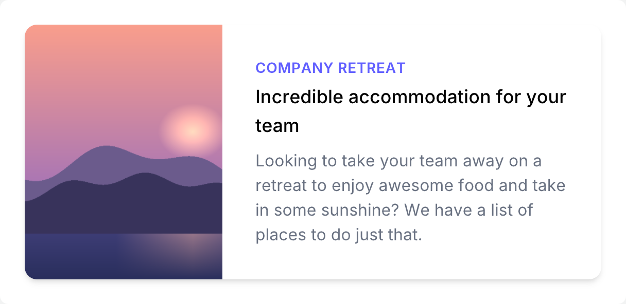
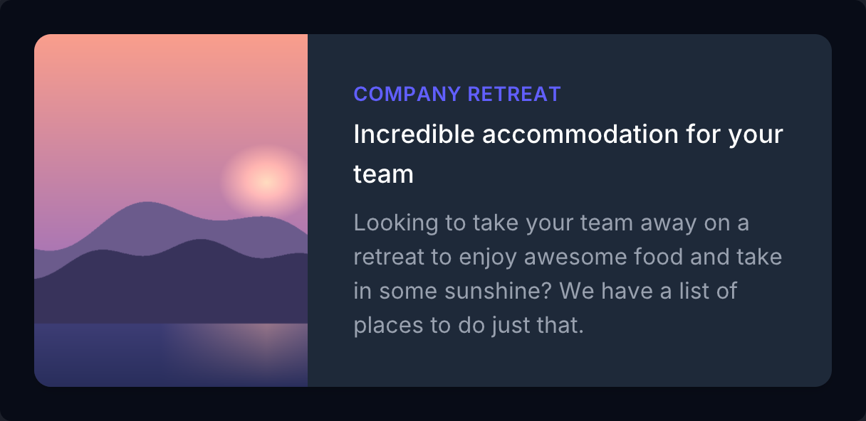
if ui.div("mx-auto max-w-md overflow-hidden rounded-xl bg-white shadow-md md:max-w-2xl dark:bg-gray-800") { if ui.div("md:flex") { if ui.div("md:shrink-0") { ui.image(DEMO_IMAGE, "h-48 w-full object-cover md:h-full md:w-48") } if ui.div("p-8") { ui.text("Company retreat", "text-sm font-semibold tracking-wide text-indigo-500 uppercase") ui.text("Incredible accommodation for your team", "mt-1 text-lg font-medium text-black dark:text-white") ui.text("Looking to take your team away on a retreat to enjoy awesome food and take in some sunshine? We have a list of places to do just that.", "mt-2 text-gray-500 dark:text-gray-400") } }}