
Text rendering
Why text in vinland-ui looks as sharp as in a browser, and the rules the renderer follows.
Blurry UI text in native apps usually has one of three causes: glyphs rasterized at one size and scaled to another, a window rendered at 1x and stretched by the compositor on a fractional-scale display, or pen positions rounded to whole pixels so spacing wobbles.
What vinland-ui does
Section titled “What vinland-ui does”| Class | Effect |
|---|---|
Physical-pixel windows |
SDL3 high-density windows; at 1.333x the framebuffer is 1.333x larger, never stretched |
Exact-size rasterization |
glyphs are rasterized for size × scale, cached per size |
Subpixel positioning |
4 horizontal phases per glyph keep advances precise |
Pixel-snapped baselines |
every line sits on a whole physical pixel |
Snapped box edges |
rects and border widths round to device pixels so 1px lines stay solid |
Font kerning |
kern and GPOS pair adjustments from the font |
Same rasterizer for icons |
SVG paths go through the glyph rasterizer and atlas |
Weights and sizes
Section titled “Weights and sizes”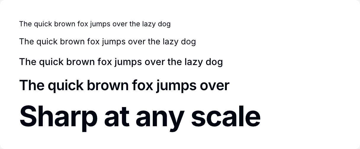
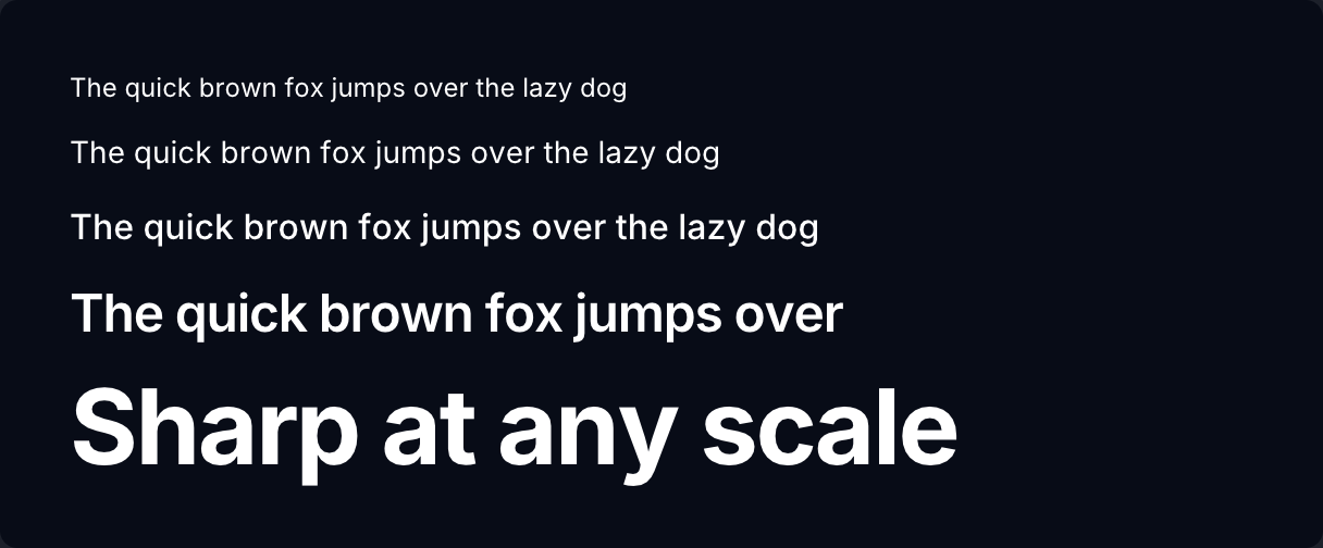
if ui.div("flex flex-col gap-3") { ui.text("The quick brown fox jumps over the lazy dog", "text-xs text-gray-950 dark:text-white") ui.text("The quick brown fox jumps over the lazy dog", "text-sm text-gray-950 dark:text-white") ui.text("The quick brown fox jumps over the lazy dog", "text-base font-medium text-gray-950 dark:text-white") ui.text("The quick brown fox jumps over", "text-2xl font-semibold tracking-tight text-gray-950 dark:text-white") ui.text("Sharp at any scale", "text-5xl font-bold tracking-tight text-gray-950 dark:text-white")}