
Component showcase
Interfaces assembled from utilities only. Nothing on this page is a built-in widget style.
Buttons
Section titled “Buttons”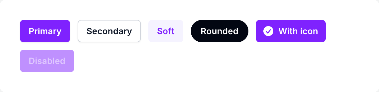
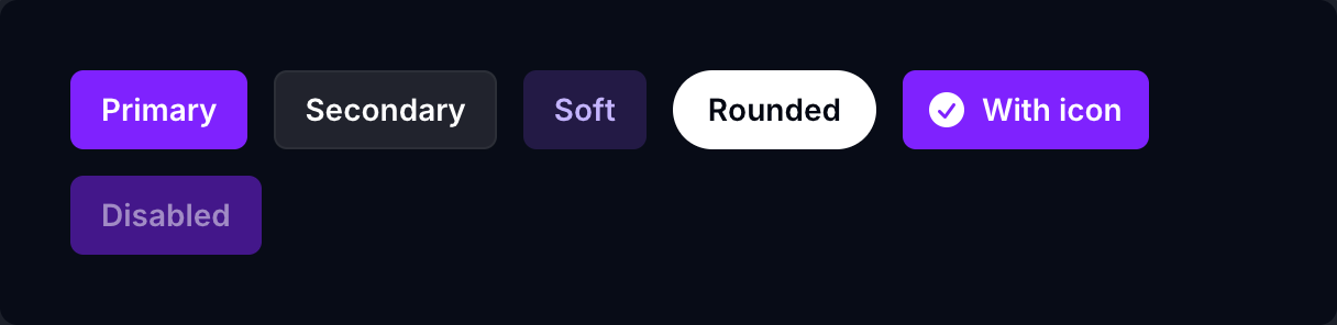
if ui.div("flex flex-wrap items-center gap-3") { ui.button("Primary", "rounded-md bg-violet-600 px-3.5 py-2 text-sm font-semibold text-white shadow-xs transition-colors hover:bg-violet-500 focus-visible:outline-2 focus-visible:outline-offset-2 focus-visible:outline-violet-600") ui.button("Secondary", "rounded-md bg-white px-3.5 py-2 text-sm font-semibold text-gray-900 shadow-xs inset-ring inset-ring-gray-300 transition-colors hover:bg-gray-50 dark:bg-white/10 dark:text-white dark:inset-ring-white/5 dark:hover:bg-white/20") ui.button("Soft", "rounded-md bg-violet-50 px-3.5 py-2 text-sm font-semibold text-violet-600 transition-colors hover:bg-violet-100 dark:bg-violet-500/20 dark:text-violet-300 dark:hover:bg-violet-500/30") ui.button("Rounded", "rounded-full bg-gray-950 px-4 py-2 text-sm font-semibold text-white transition-colors hover:bg-gray-800 dark:bg-white dark:text-gray-950 dark:hover:bg-gray-200") if ui.button_box("inline-flex items-center gap-1.5 rounded-md bg-violet-600 px-3 py-2 text-sm font-semibold text-white transition-colors hover:bg-violet-500") { ui.icon(IC.check_circle, "-ml-0.5 size-5") ui.text("With icon") } ui.button("Disabled", "rounded-md bg-violet-600 px-3.5 py-2 text-sm font-semibold text-white disabled:opacity-50 disabled:cursor-not-allowed", {.Disabled})}Badges
Section titled “Badges”

if ui.div("flex flex-wrap gap-2") { for b in ([][2]string{{"Gray", "gray"}, {"Red", "red"}, {"Yellow", "yellow"}, {"Green", "green"}, {"Blue", "blue"}, {"Indigo", "indigo"}, {"Purple", "purple"}, {"Pink", "pink"}}) { ui.key(b[0]) ui.text(b[0], fmt.tprintf("rounded-md bg-%s-50 px-2 py-1 text-xs font-medium text-%s-700 inset-ring inset-ring-%s-600/20 dark:bg-%s-400/10 dark:text-%s-400 dark:inset-ring-%s-400/20", b[1], b[1], b[1], b[1], b[1], b[1])) }}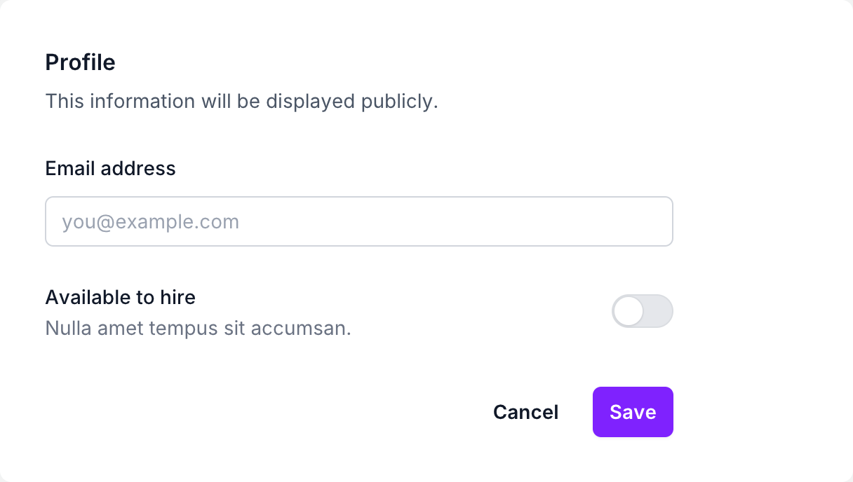
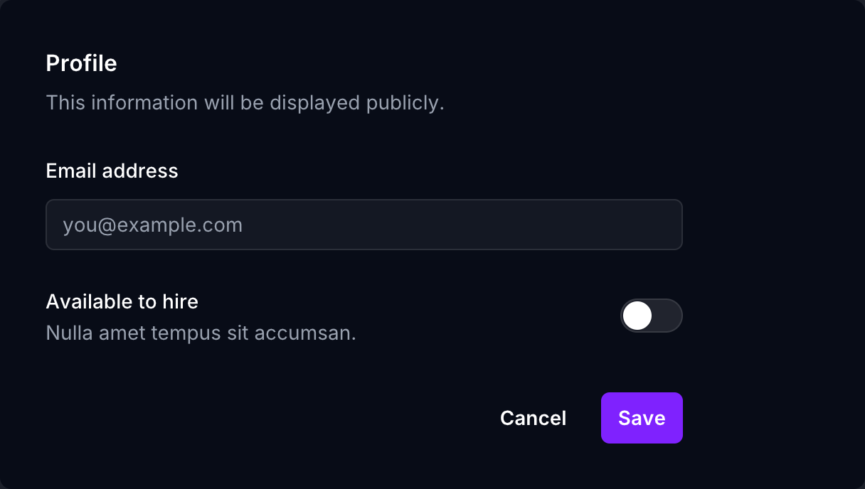
if ui.div("w-full max-w-md") { ui.text("Profile", "text-base font-semibold text-gray-900 dark:text-white") ui.text("This information will be displayed publicly.", "mt-1 text-sm/6 text-gray-600 dark:text-gray-400") if ui.div("mt-6 flex flex-col gap-2") { ui.text("Email address", "text-sm/6 font-medium text-gray-900 dark:text-white") ui.text_input(&state.email, "rounded-md bg-white px-3 py-1.5 text-base text-gray-900 outline-1 -outline-offset-1 outline-gray-300 placeholder:text-gray-400 focus:outline-2 focus:-outline-offset-2 focus:outline-violet-600 sm:text-sm/6 dark:bg-white/5 dark:text-white dark:outline-white/10", "you@example.com") } if ui.div("mt-6 flex items-center justify-between") { if ui.div("flex flex-col") { ui.text("Available to hire", "text-sm/6 font-medium text-gray-900 dark:text-white") ui.text("Nulla amet tempus sit accumsan.", "text-sm text-gray-500 dark:text-gray-400") } toggle(&state.toggle) } if ui.div("mt-8 flex justify-end gap-3") { ui.button("Cancel", "rounded-md px-3 py-2 text-sm font-semibold text-gray-900 hover:bg-gray-50 dark:text-white dark:hover:bg-white/5") ui.button("Save", "rounded-md bg-violet-600 px-3 py-2 text-sm font-semibold text-white shadow-xs hover:bg-violet-500") }}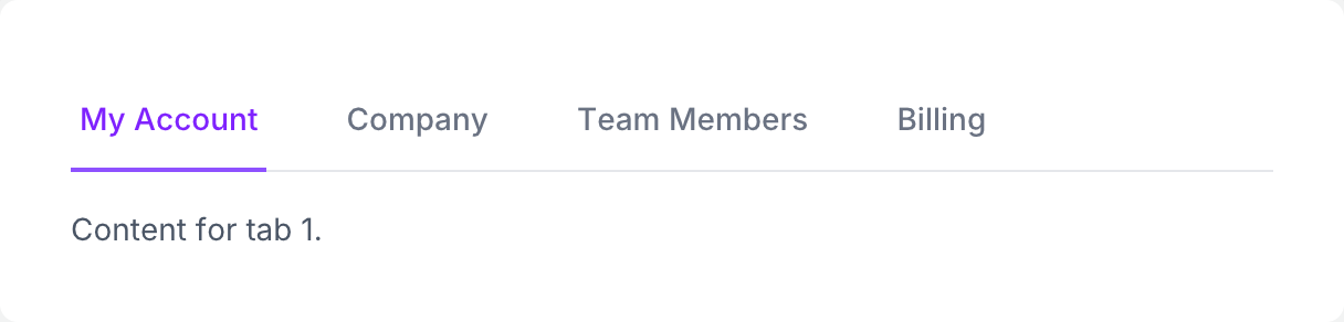
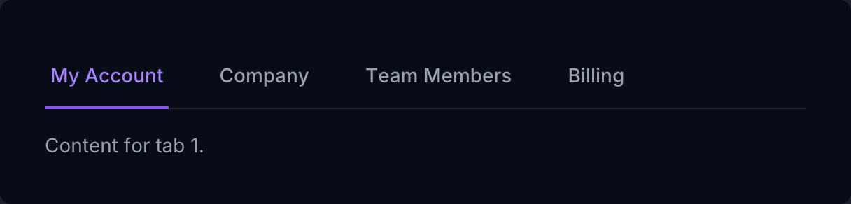
if ui.div("w-full") { if ui.div("flex gap-8 border-b border-gray-200 dark:border-white/10") { for label, i in ([]string{"My Account", "Company", "Team Members", "Billing"}) { ui.key(label) if ui.button(label, "-mb-px border-b-2 border-transparent px-1 py-3 text-sm font-medium text-gray-500 transition-colors hover:border-gray-300 hover:text-gray-700 aria-selected:border-violet-500 aria-selected:text-violet-600 dark:text-gray-400 dark:hover:text-gray-200 dark:aria-selected:text-violet-400", state.tab == i ? {.Selected} : {}) { state.tab = i } } } ui.text(fmt.tprintf("Content for tab %d.", state.tab + 1), "pt-4 text-sm text-gray-600 dark:text-gray-400")}Stacked list
Section titled “Stacked list”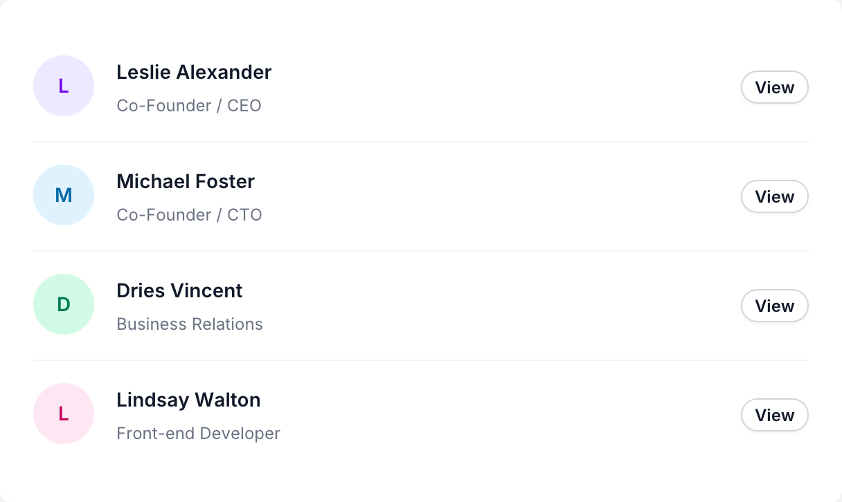
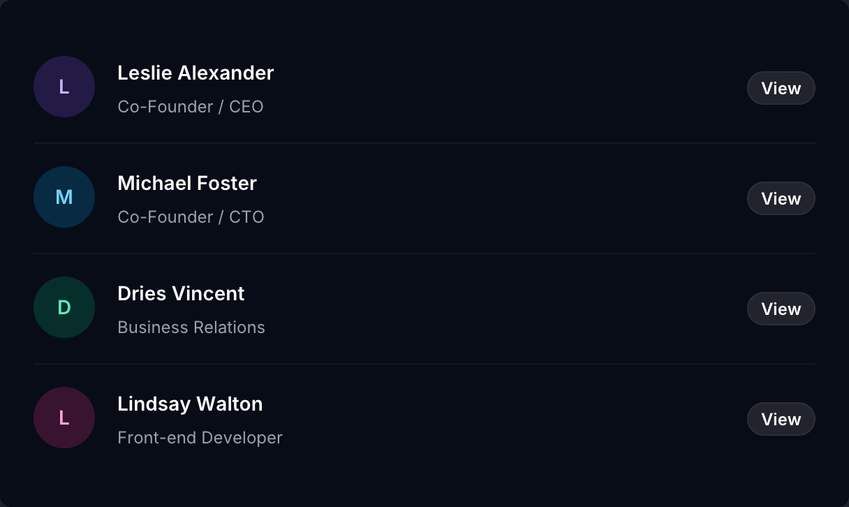
if ui.div("w-full divide-y divide-gray-100 dark:divide-white/5") { people := [?][3]string{{"Leslie Alexander", "Co-Founder / CEO", "violet"}, {"Michael Foster", "Co-Founder / CTO", "sky"}, {"Dries Vincent", "Business Relations", "emerald"}, {"Lindsay Walton", "Front-end Developer", "pink"}} for p, i in people { ui.key(i) if ui.div("flex items-center justify-between gap-x-6 py-4") { if ui.div("flex min-w-0 gap-x-4") { ui.text(p[0][:1], fmt.tprintf("flex size-11 shrink-0 items-center justify-center rounded-full bg-%s-100 text-sm font-semibold text-%s-700 dark:bg-%s-500/20 dark:text-%s-300", p[2], p[2], p[2], p[2])) if ui.div("min-w-0 flex-auto") { ui.text(p[0], "text-sm/6 font-semibold text-gray-900 dark:text-white") ui.text(p[1], "mt-0.5 truncate text-xs/5 text-gray-500 dark:text-gray-400") } } ui.button("View", "rounded-full bg-white px-2.5 py-1 text-xs font-semibold text-gray-900 shadow-xs inset-ring inset-ring-gray-300 hover:bg-gray-50 dark:bg-white/10 dark:text-white dark:inset-ring-white/5 dark:hover:bg-white/20") } }}Pricing card
Section titled “Pricing card”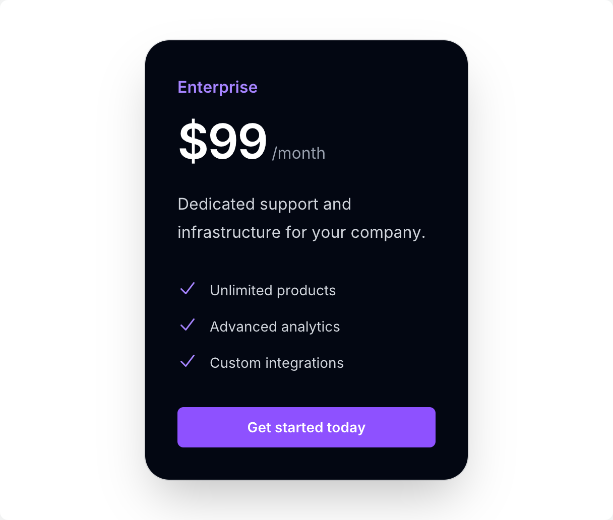
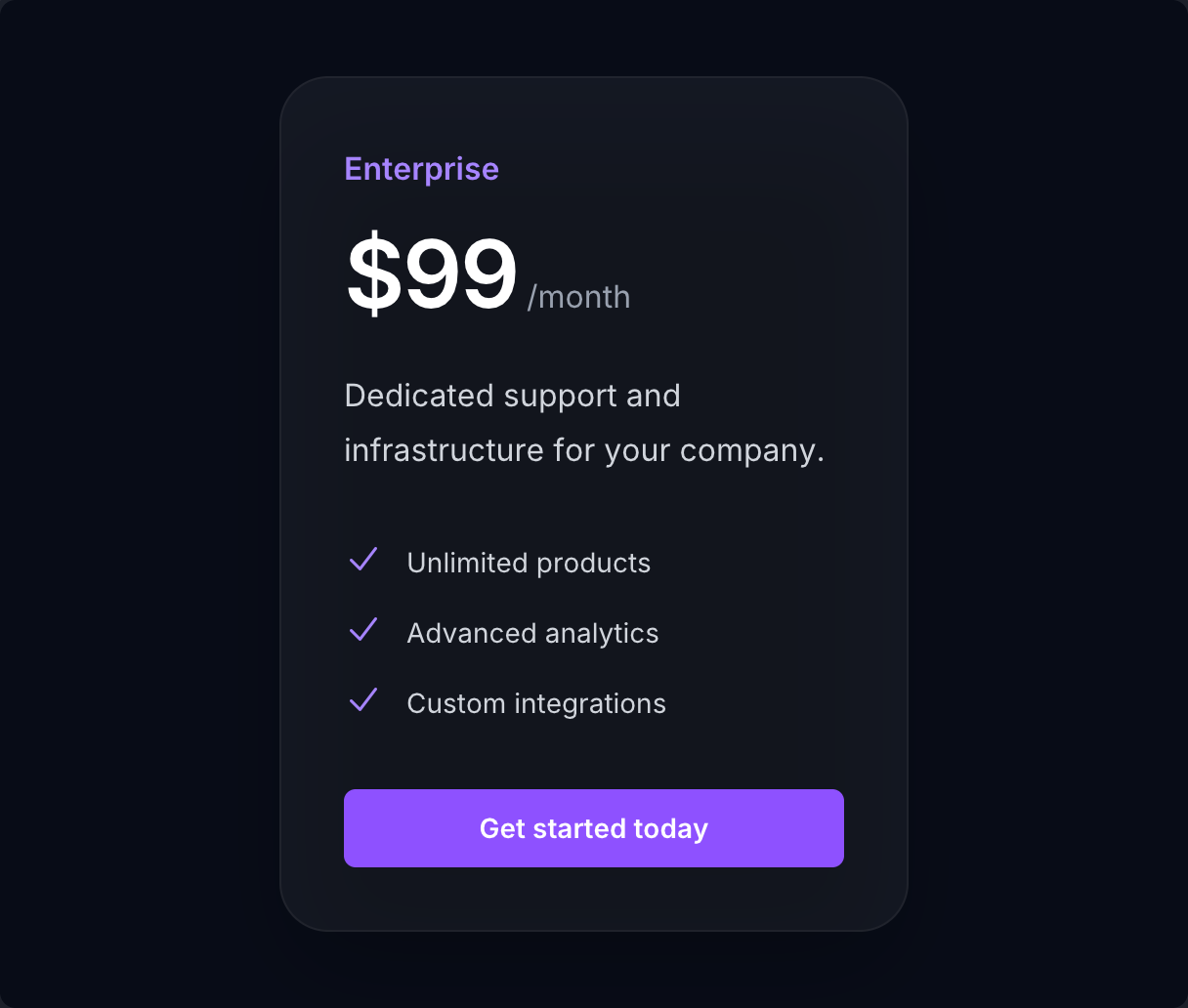
if ui.div("w-full max-w-xs rounded-3xl bg-gray-950 p-8 shadow-2xl ring-1 ring-gray-900/10 dark:bg-white/5 dark:ring-white/10") { ui.text("Enterprise", "text-base/7 font-semibold text-violet-400") if ui.p("mt-4 flex items-baseline") { ui.span("$99", "text-5xl font-semibold tracking-tight text-white") ui.span(" /month", "text-base text-gray-400") } ui.text("Dedicated support and infrastructure for your company.", "mt-6 text-base/7 text-gray-300") if ui.div("mt-8 flex flex-col gap-3") { for f in ([]string{"Unlimited products", "Advanced analytics", "Custom integrations"}) { ui.key(f) if ui.div("flex gap-3") { ui.icon(IC.check, "size-5 shrink-0 text-violet-400") ui.text(f, "text-sm/6 text-gray-300") } } } ui.button("Get started today", "mt-8 block rounded-md bg-violet-500 px-3.5 py-2.5 text-center text-sm font-semibold text-white shadow-xs transition-colors hover:bg-violet-400")}Notification
Section titled “Notification”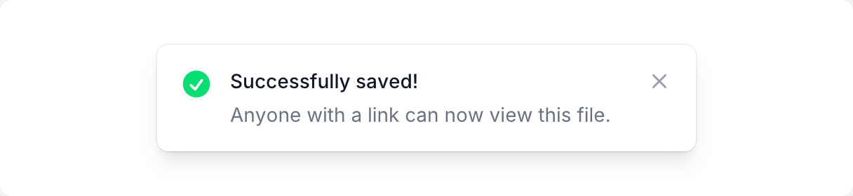

if ui.div("flex w-full max-w-sm gap-3 rounded-lg bg-white p-4 shadow-lg ring-1 ring-black/5 dark:bg-gray-800 dark:ring-white/10") { ui.icon(IC.check_circle, "size-6 shrink-0 text-green-400") if ui.div("flex-1") { ui.text("Successfully saved!", "text-sm font-medium text-gray-900 dark:text-white") ui.text("Anyone with a link can now view this file.", "mt-1 text-sm text-gray-500 dark:text-gray-400") } ui.icon(IC.x_mark, "size-5 shrink-0 text-gray-400")}Counter
Section titled “Counter”State lives in your own variables; the UI rebuilds from it every frame.


if ui.div("flex items-center gap-4") { if ui.button_box("flex size-9 items-center justify-center rounded-full bg-gray-100 text-gray-700 transition-colors hover:bg-gray-200 active:scale-95 dark:bg-white/10 dark:text-white dark:hover:bg-white/15") { ui.icon(IC.minus, "size-4") if ui.clicked() { state.counter -= 1 } } ui.text(fmt.tprintf("%d", state.counter), "w-12 text-center text-3xl font-semibold tabular-nums text-gray-950 dark:text-white") if ui.button_box("flex size-9 items-center justify-center rounded-full bg-violet-600 text-white transition-colors hover:bg-violet-500 active:scale-95") { ui.icon(IC.plus, "size-4") if ui.clicked() { state.counter += 1 } }}